GOV.UK Coronavirus response
Coronavirus landing page: defining a hierarchy of information
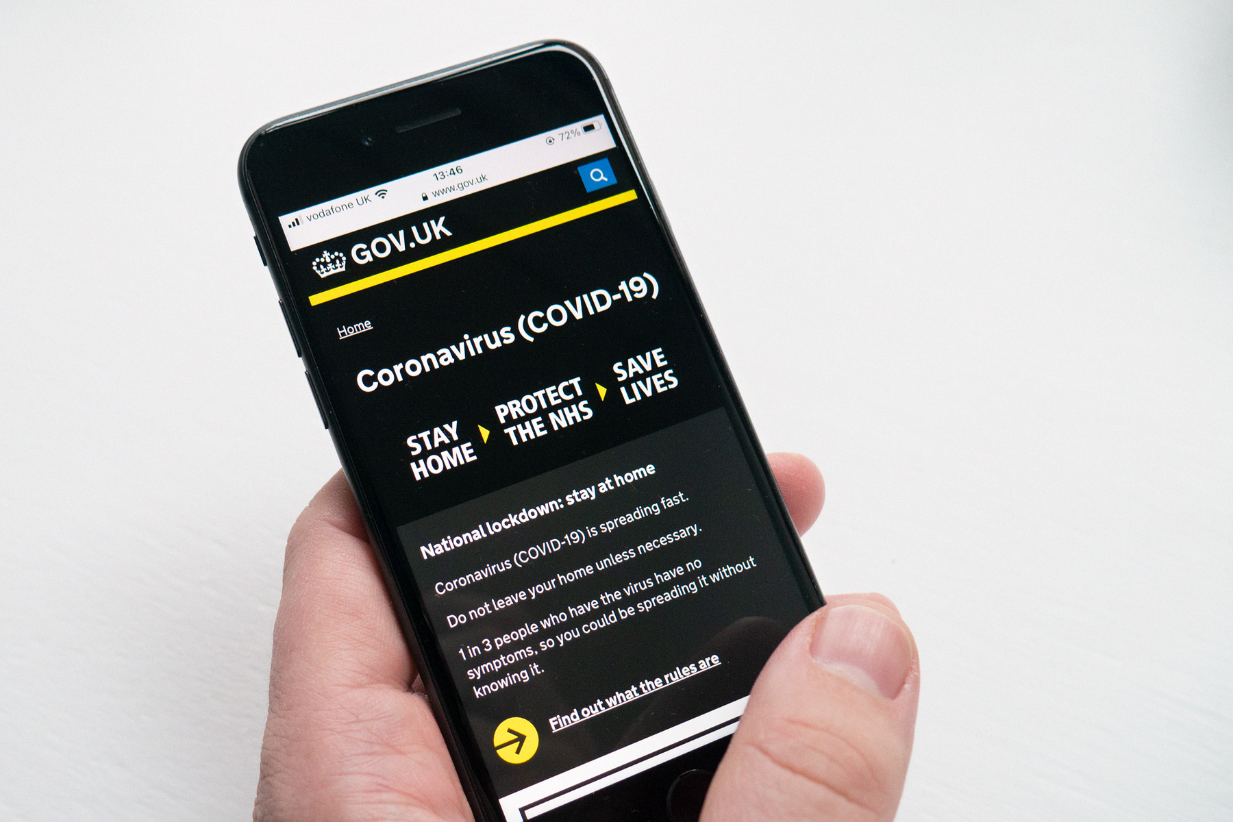
The GOV.UK coronavirus landing page was designed to meet the following hierarchy of needs:
- What everyone must do
- What people must do if they have symptoms
- Contextual guidance and help available
- Statistics & what the government is doing
The design of the page constantly evolved alongside the pandemic. We increased functionality and prioritised the information architecture in order to better reflect user needs as the pandemic ebbed and flowed. We were data informed in our approach and constantly monitored engagement with page elements as patterns in usage began to form over time.
The first sketch I did in the opening days of the pandemic as we were delivering guidance and services at pace
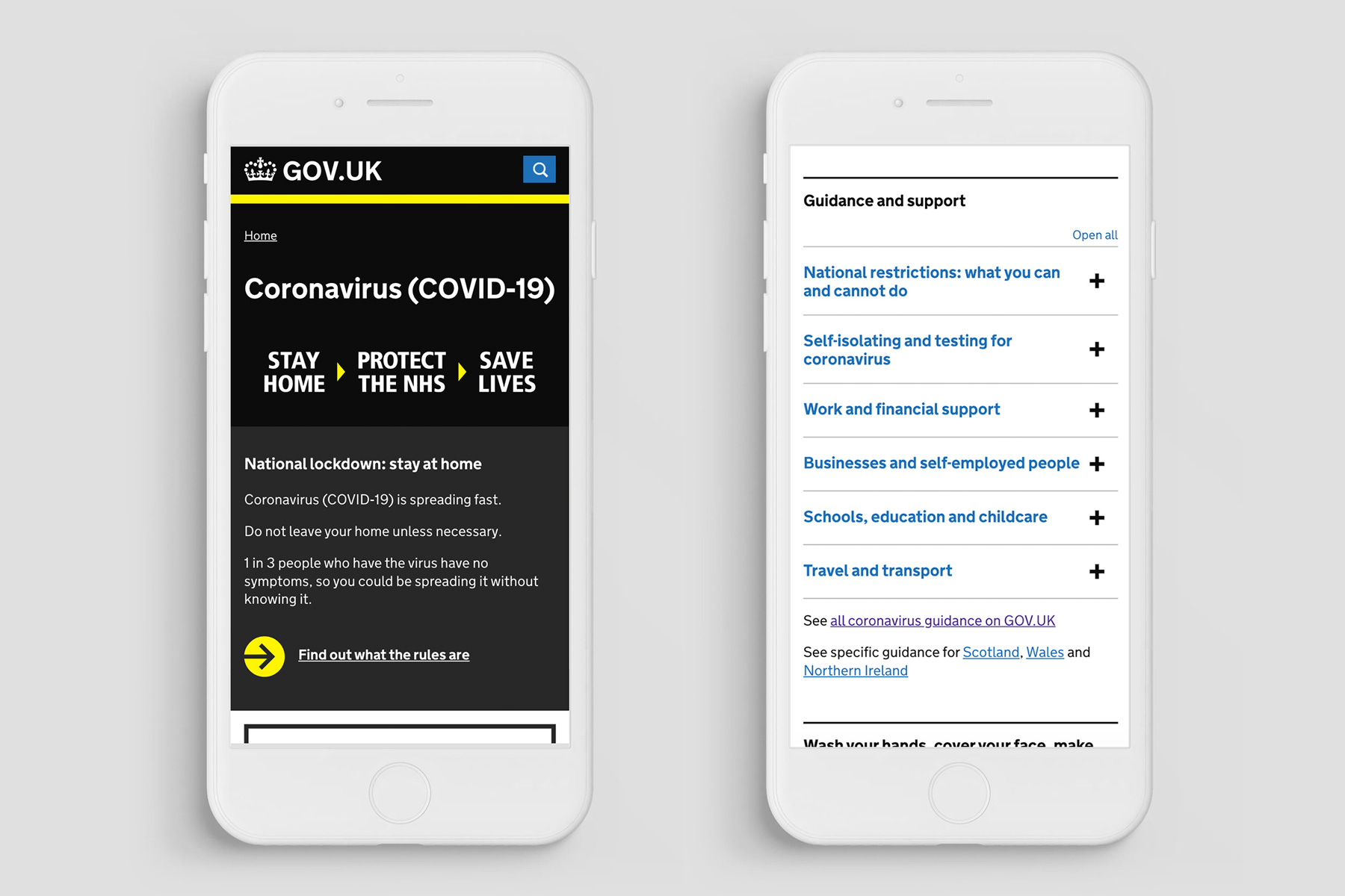
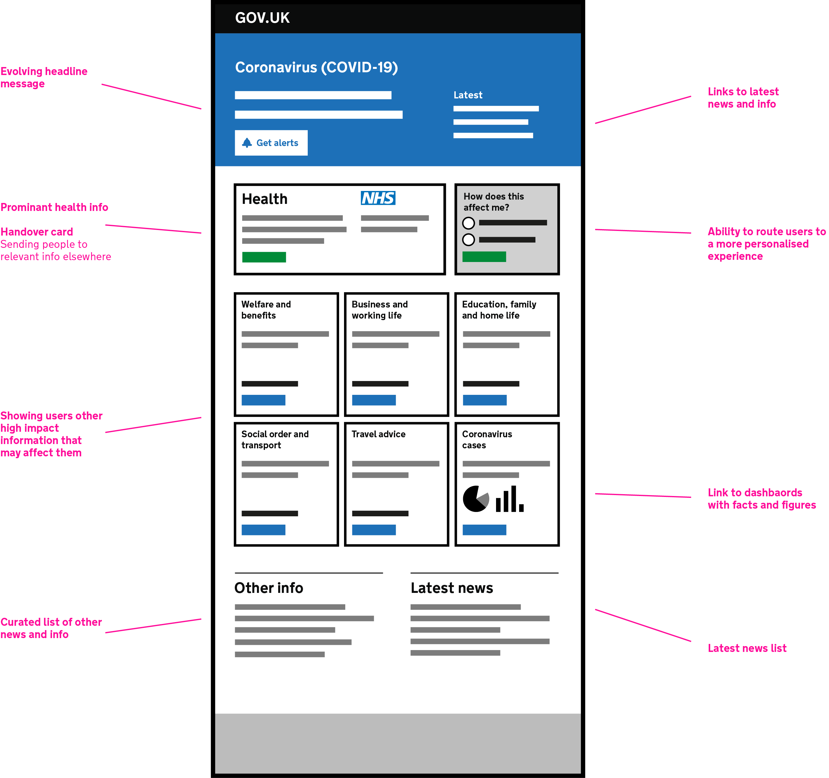
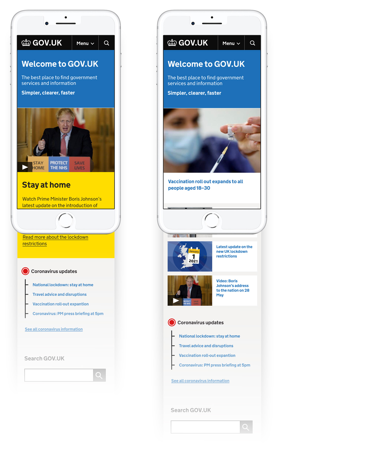
Mobile screens of the Coronavirus landing page
Businesses were also a key user of GOV.UK guidance during this difficult period. Guidance and support options were constantly evolving and we delivered at pace to make it as easy as possible for businesses to get the support they needed.
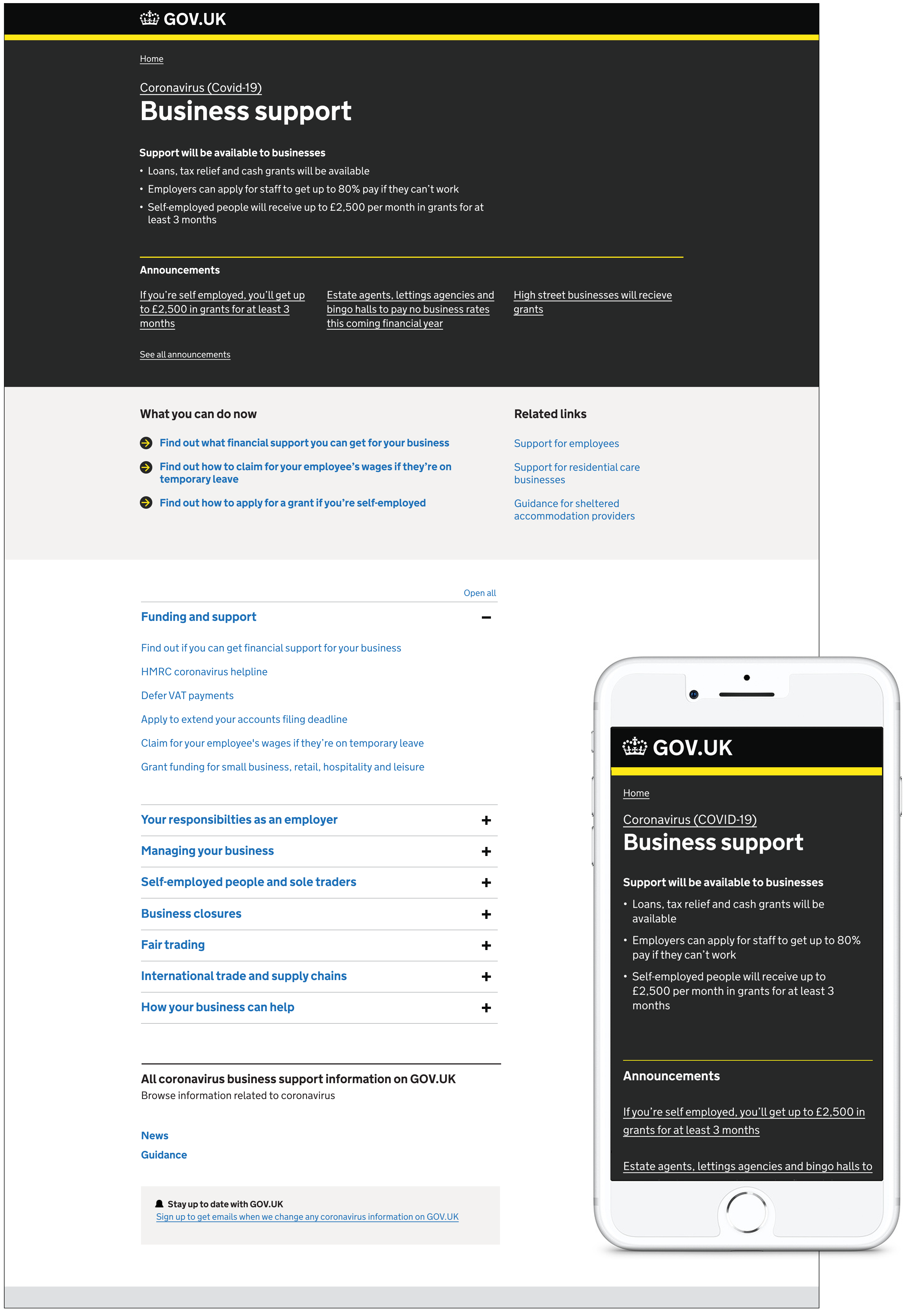
Business support landing page – desktop and mobile
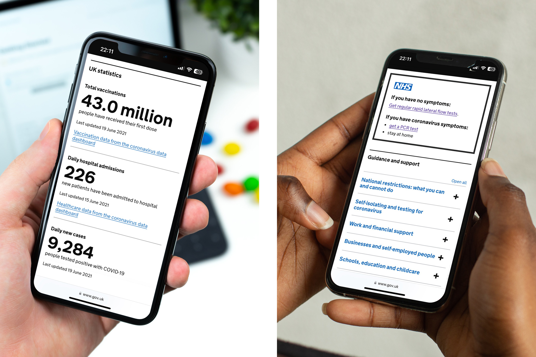
A home for accurate statistics
We worked with the product team at Public Health England to develop an accessible and trustworthy home for statistical information related to the pandemic. This covered date such as positive test cases, geographical trends and hospital availability.
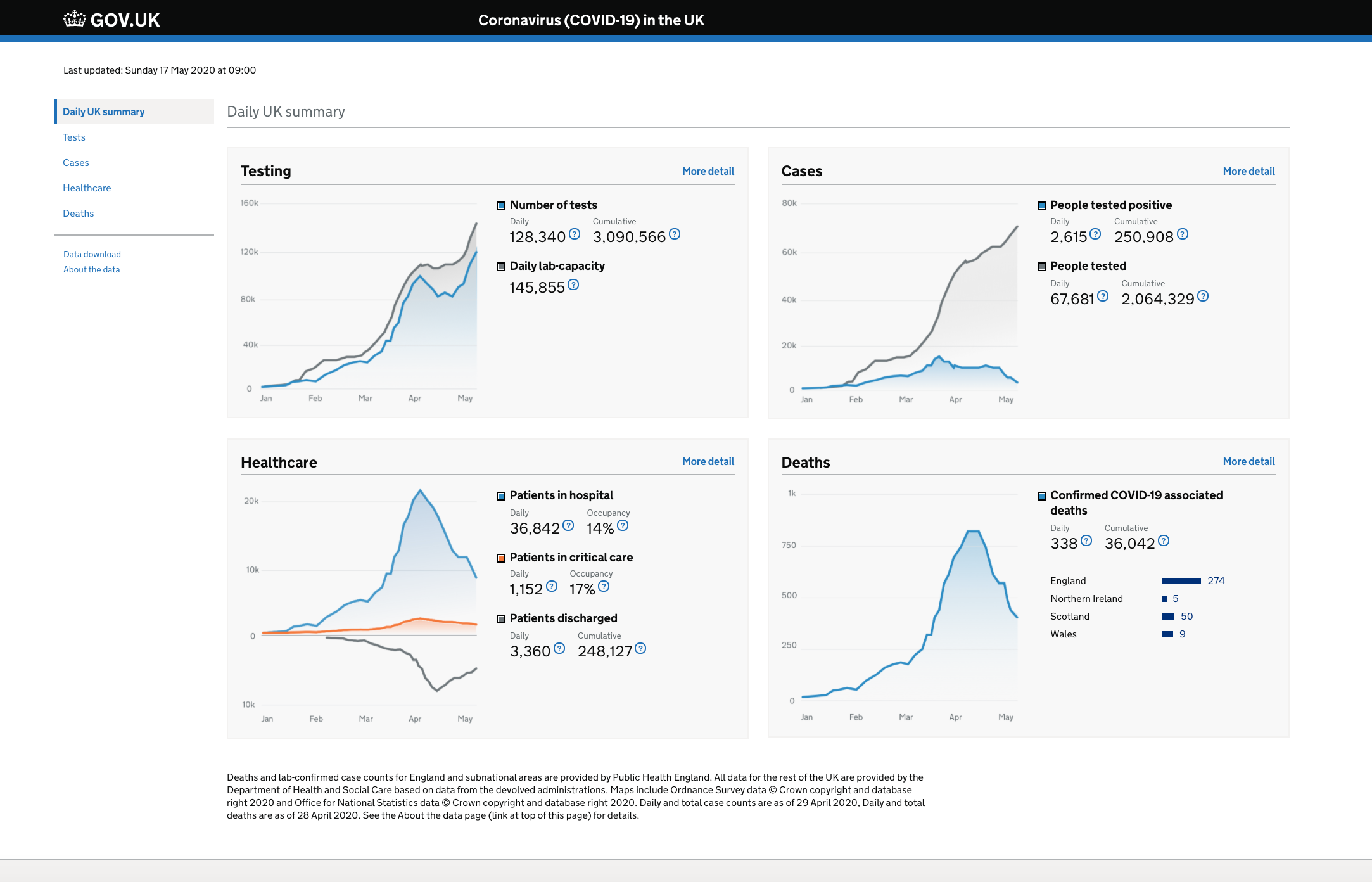
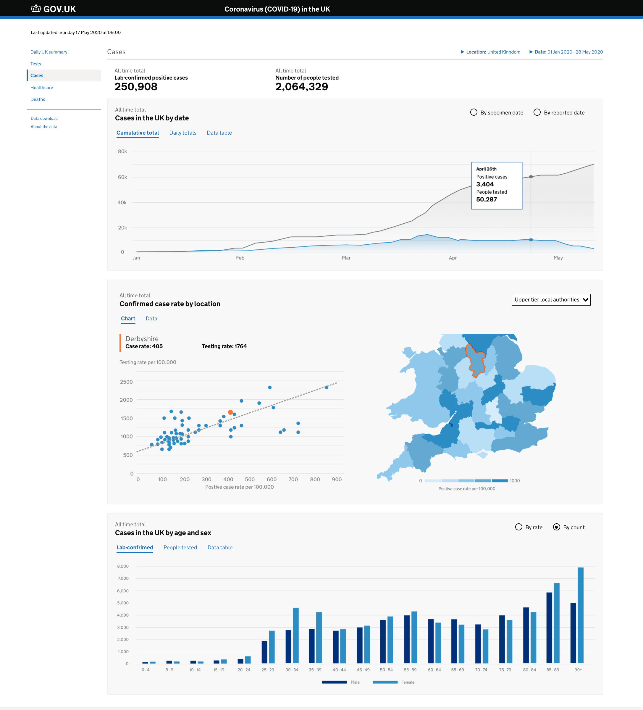
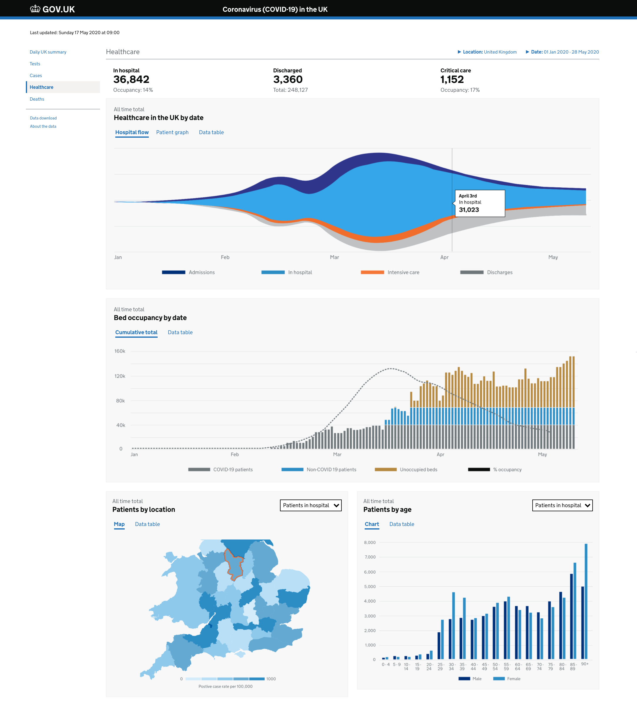
Working with colleagues at Public Health England we developed a comprehensive overview of statistical information related to the pandemic
Iterating the GOV.UK homepage to meet new user expectations
The GOV.UK homepage wasn't seen as dynamic enough and hasn't changed much over the last few years. Because of its rather static nature it isn't meeting user expectations when people come to GOV.UK for critical information needs during times of uncertainty or flux. We tested ways in which we could better meet user needs by having trending content at the top of the homepage and also building out a more dynamic featured section to cater for a bigger selection of topical government content.
This work involved close collaboration with central government communication leads in order to drive an effective and coherent editorial policy.
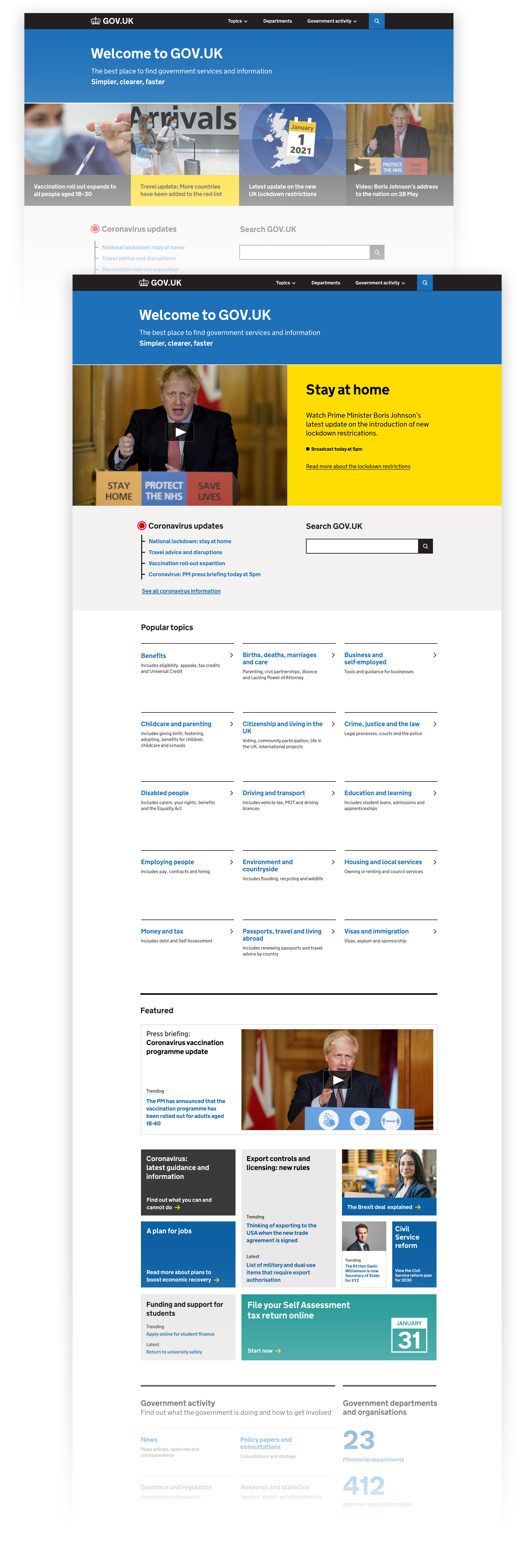
Homepage designs showing urgent topical information and a more dynamic featured section