Which? app
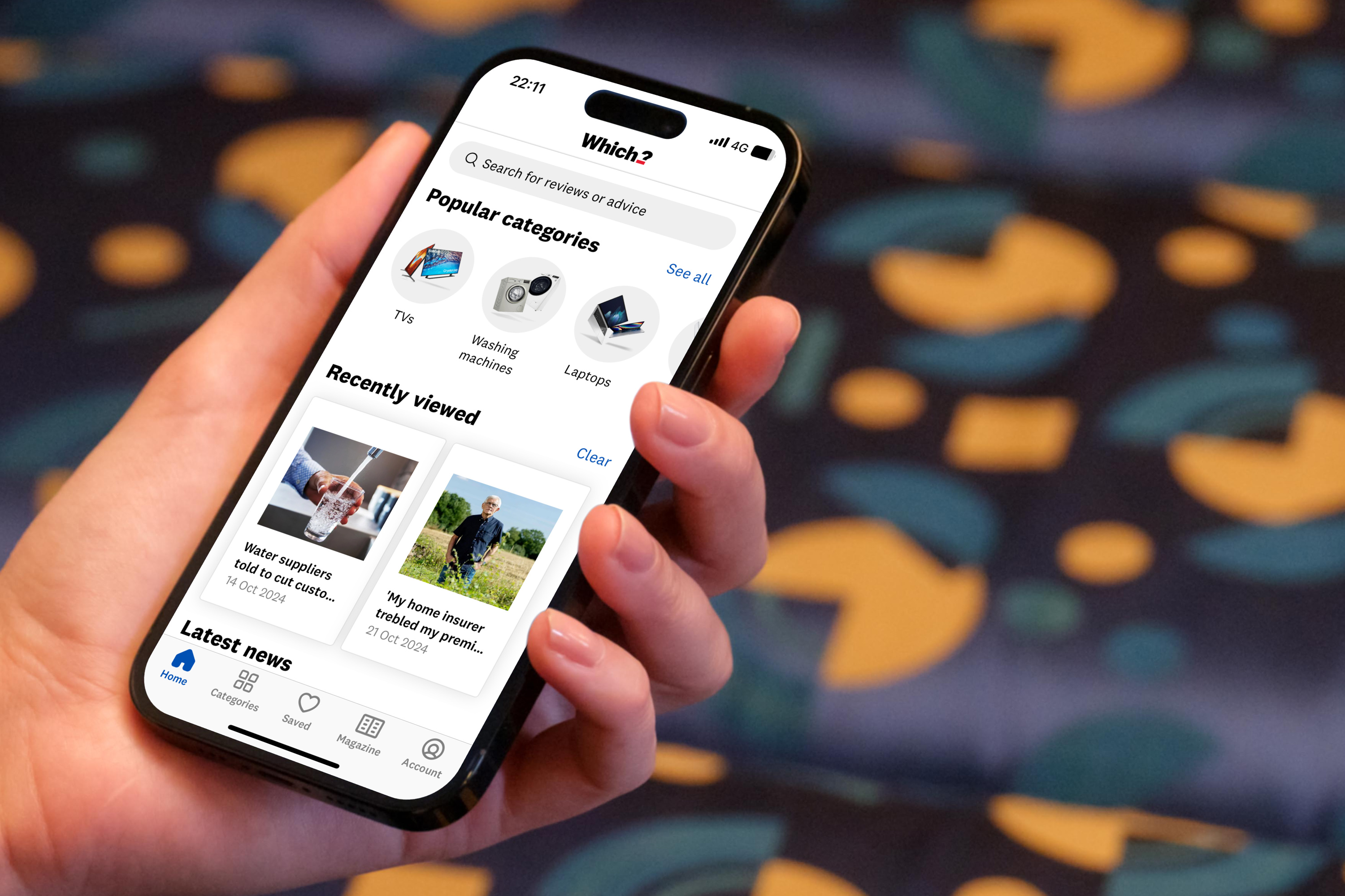
The top section of the new app homescreen
The Which? app was built to enable users on the go to gain access to the UK’s biggest library of expert reviews, featuring top-rated Best Buys and other Great Value product picks. The app wasn’t meeting user needs and engagement figures had plateaued. We needed to figure out why this was happening.
My role
- Strategic product & design direction
- User reseach prioritisation
- Commercial OKR accountability
- Detailed design critiques
- Rapid prototyping of new journeys
Outcomes
- App engagement up 120% year-on-year
- Affiliate revenue up 150% year-on-year
- Increased search satisfaction by 13% points
- 75% reduction in page load time
- The app reached number 2 in the App Store for the UK ‘Magazine and newspapers’ category
Fixing the basics
My team conducted thorough research and analysis, enabling us to identify key user pain points. The app was struggling with stability issues and insights showed us this was having a detrimental impact on user satisfaction. People were also struggling to find things – with areas such as the search experience and IA structure coming under scrutiny.
Based on the insights generated the squad focused on improving the observability of the app. We were able to identify and fix key performance issues related to the login experience and general lagging issues users were having. We were also able to speed up homescreen and general page load times – knocking an average of 75% off the homescreen load time for users.
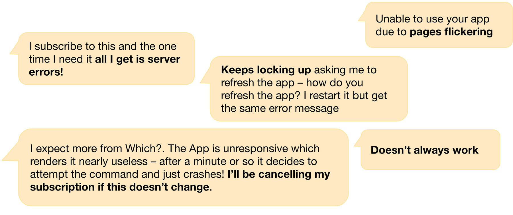
Some of the negative feedback we were getting about the app experience
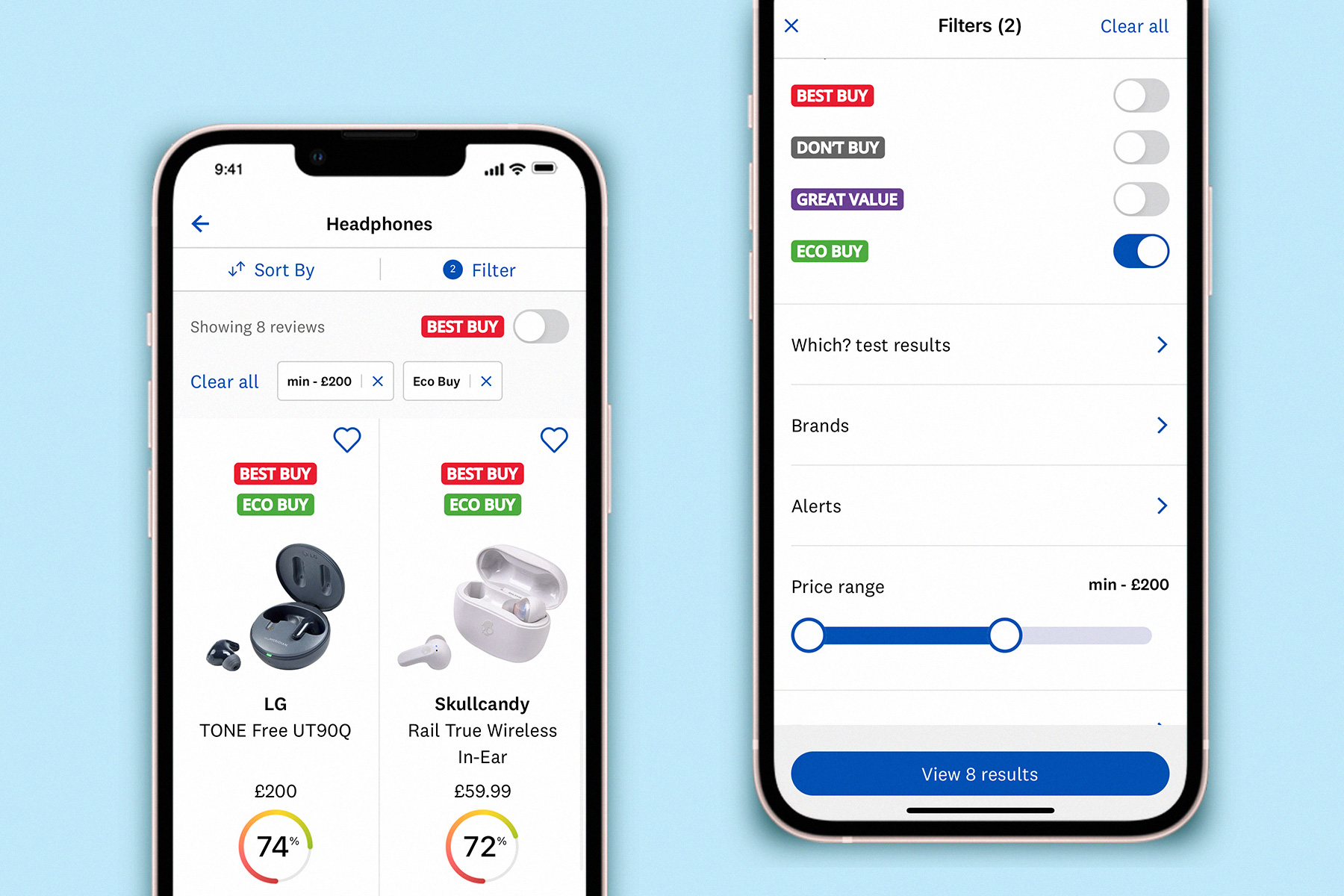
Improving relevance and findability
We spent time improving the homescreen design to make it more dynamic and relevant on an ongoing basis to encourage more return usage. We completely redesigned the navigation journey UI and incorporated significant IA updates off the back of tree-testing research. Improvements we made to the search experience increased search satisfaction by 13% points.
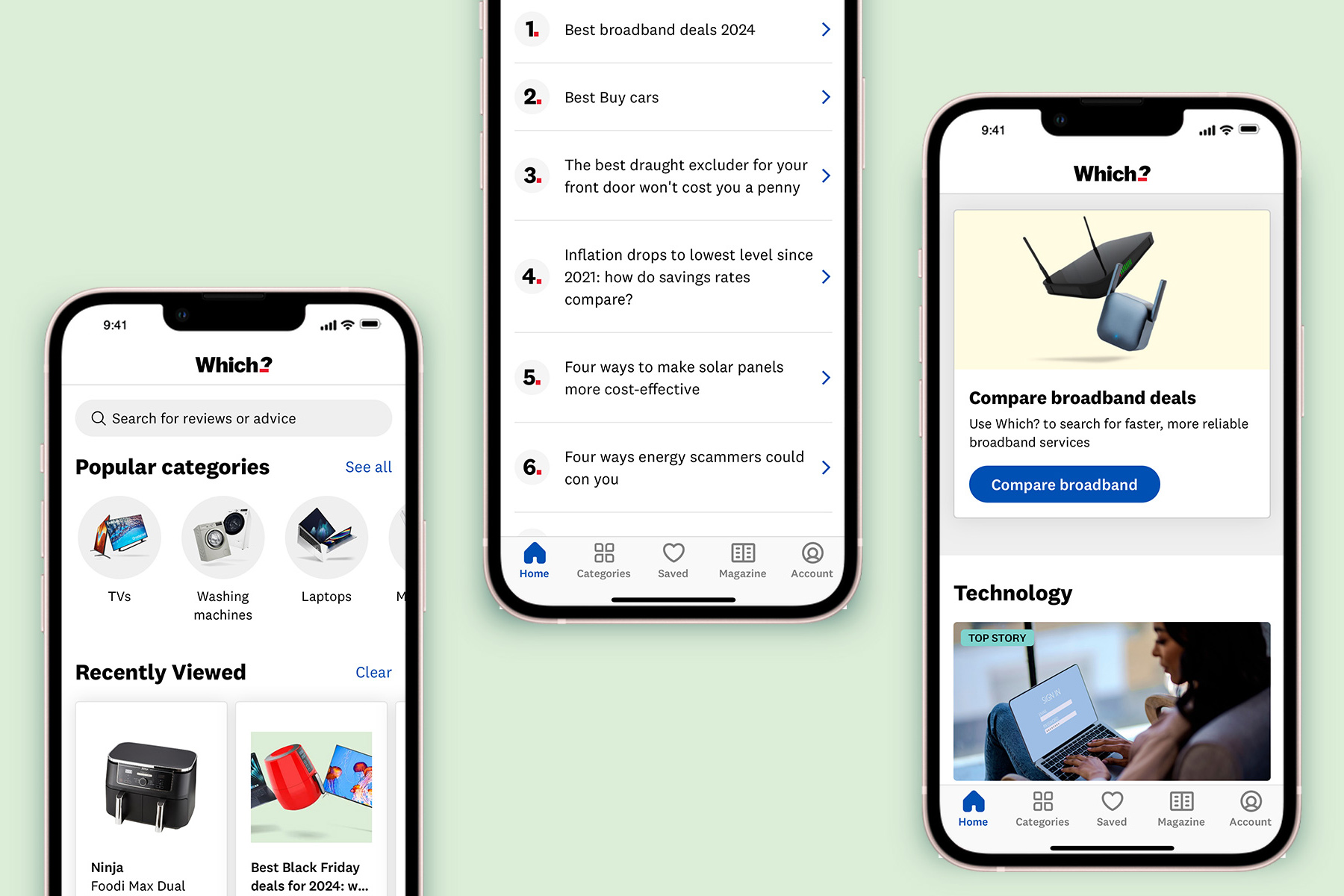
Various sections of the app homescreen, highlighting popular and previously viewed content
By prioritising this user feedback and fixing identified issues regarding app stability and content findability we’ve been able to grow app engagement by 120% year on year. By fixing the basics we’ve also been able to increase member retention. There has been a significant uplift in positive app reviews across the different app stores. The app reached number 2 in the App Store for the UK ‘Magazine and newspapers’ category in 2024.
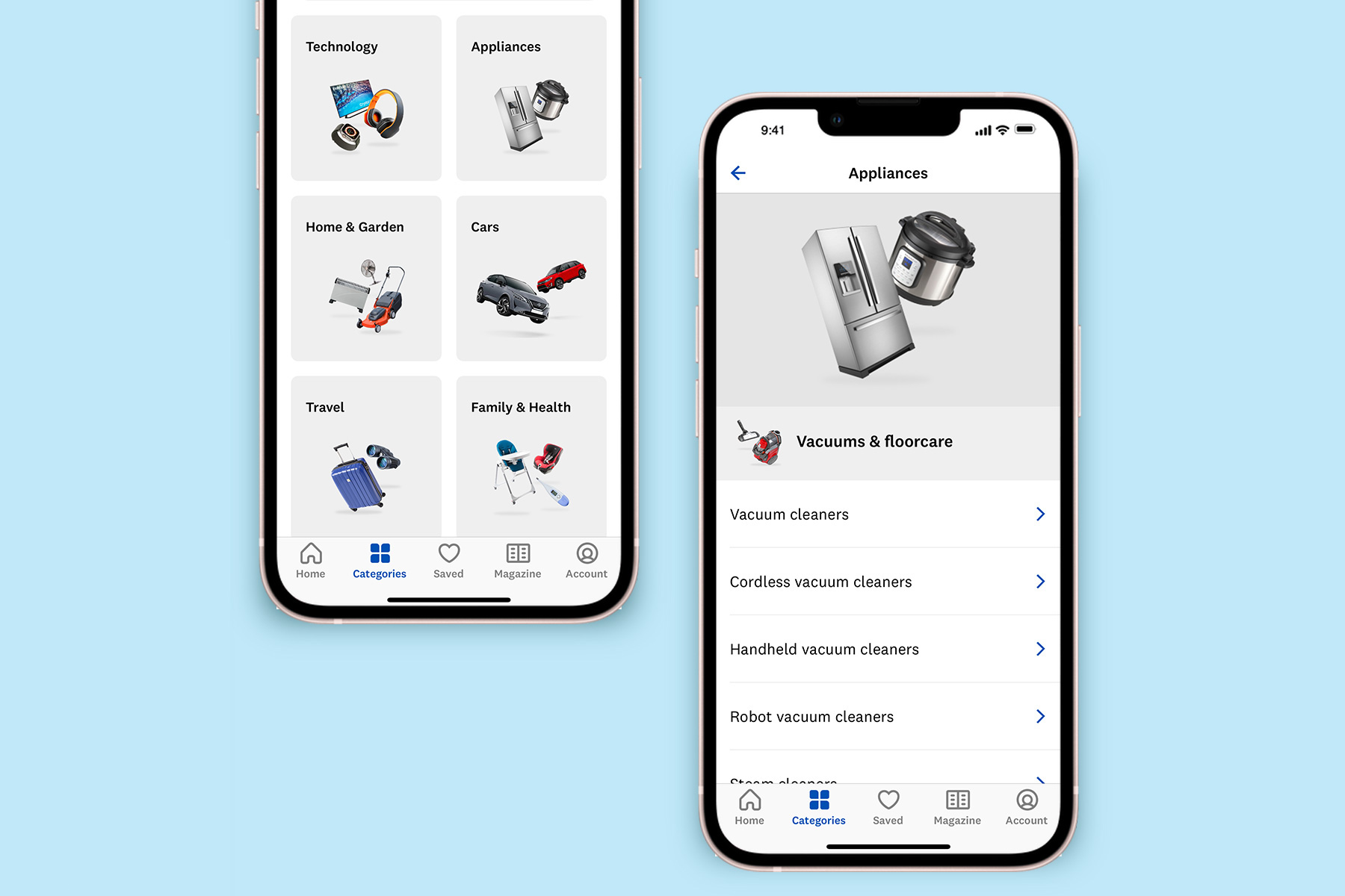
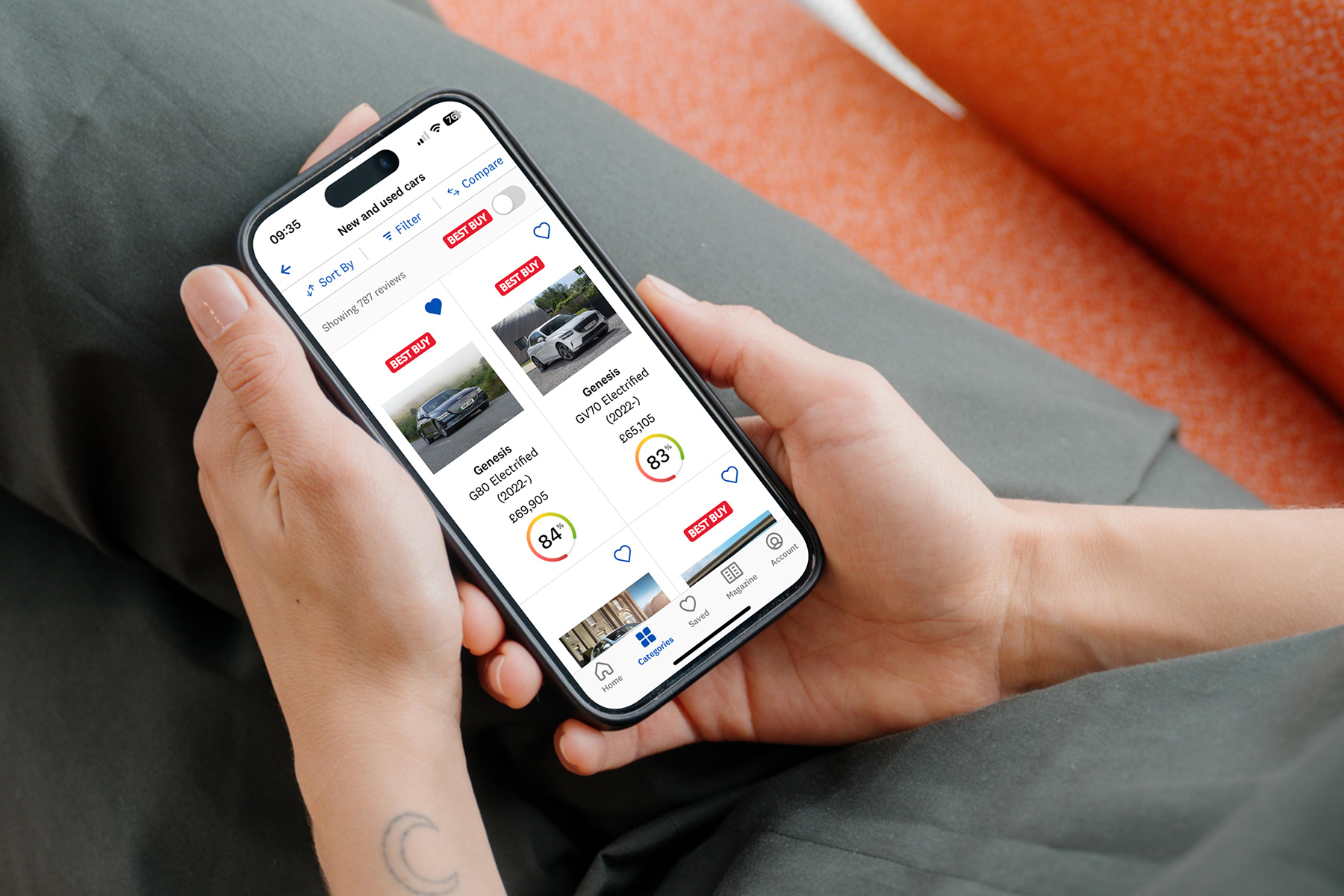
Screens from the Which? iOS app showing the navigation journey
Improving the research and buying experience
We have worked hard to make it easier for members to hone in on the product features that really matter to them. We made it simple to compare products side-by-side so people were confident in making the right purchase decisions. Affiliate income increased dramatically year on year supported by design improvements to the consumer research and buying journey.
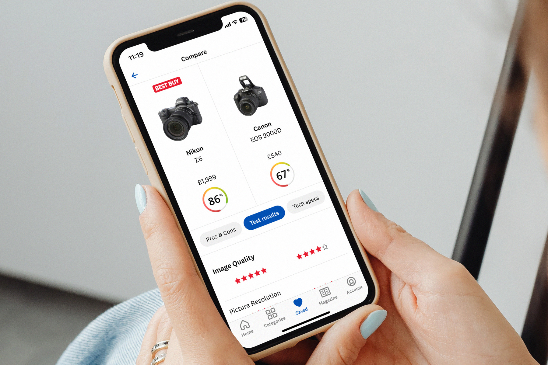
More screens from the Which? iOS app showing the reviews and comparison journey
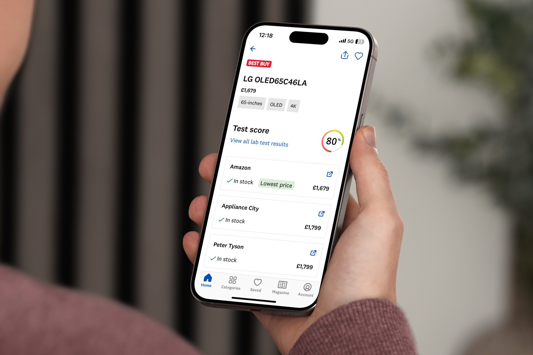
A user going on a purchase journey from the app. Affiliate income from the app increased 150% year on year supported by design improvements.
One performant app
Which? is famous for its print magazine. For quite some time we had a digital version of the magazine, but it lived in its own reader app. We decided to simplify our app estate and incorporate the digital magazine into the core app proposition. Moving from 2 separate apps to one.
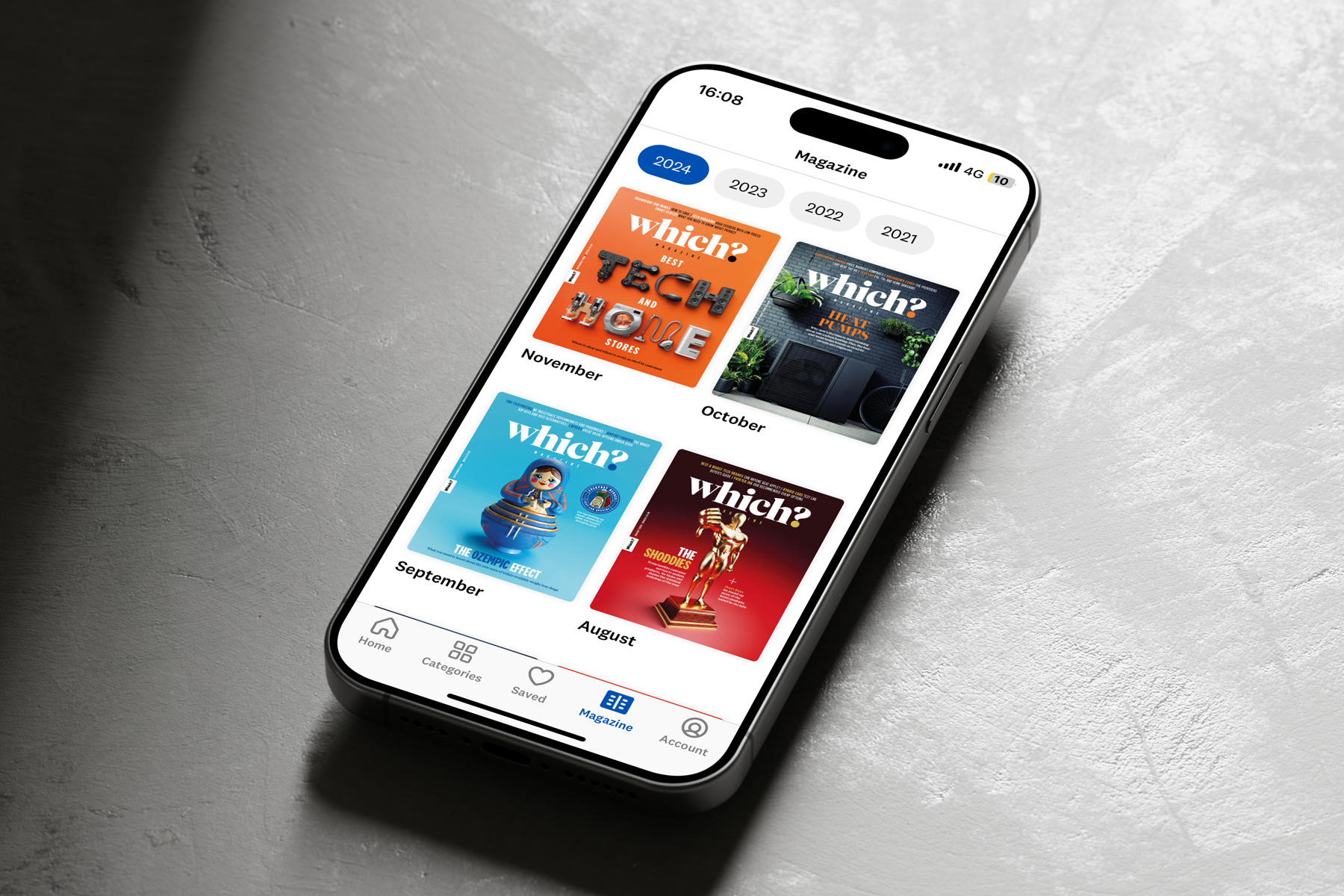
We introduced a digital magazine into the app for paying members
Future features
We are always looking for ways to enhance the product research experience for our members and have been building an AI enhanced product search and comparison experience.
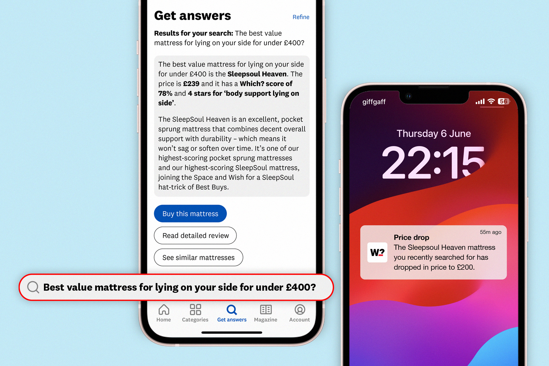
This AI enhanced smart search will give users direct answers to their often niche queries. We'll also enable smarter notifications based on their previous searches.
Contributing designers: Will Pickersgill & Christèle Tai